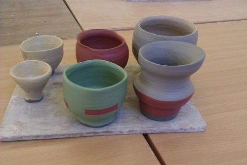
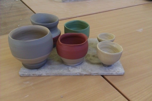
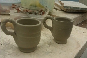
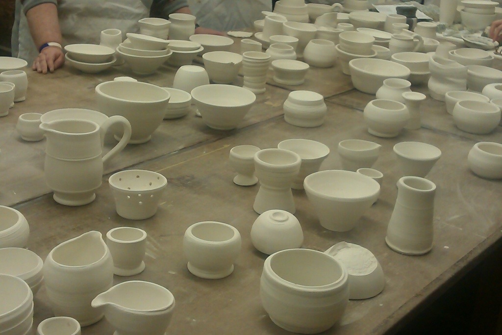
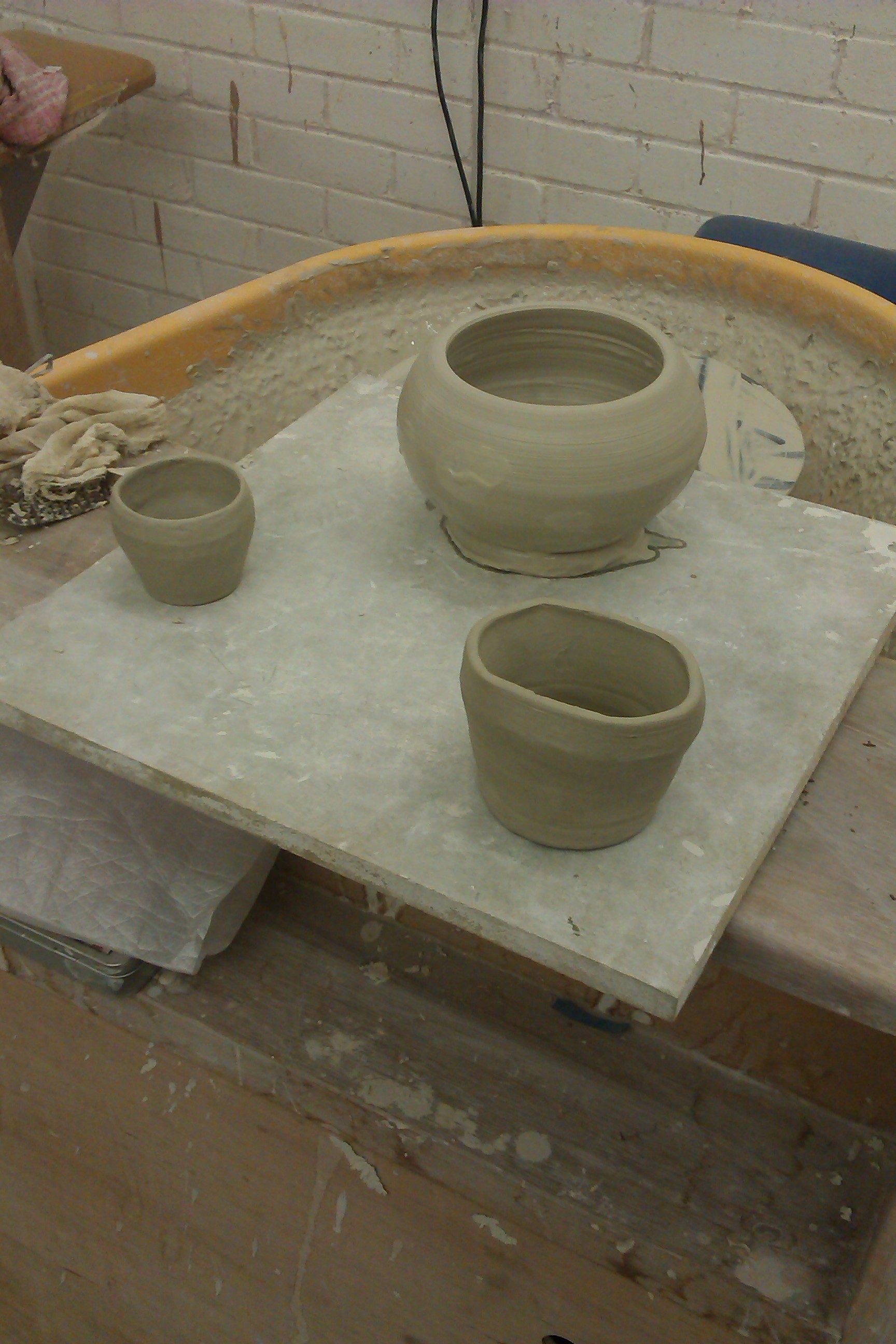
Throwing Pots. Saturday Class – Photo Gallery
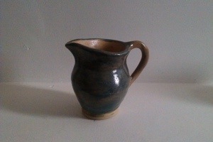
1. Milk Jug
I made this milk jug for my friend Natalie. I knew I wanted the finish to be blue and white but was unsure how well the word ‘milk’ would come out once fired. Overall I was pleased with the result. The white slip came out slightly creamier than expected but the word ‘milk’ is very clear. The handle was a bit of an experiment and doesn’t look great head on but from the side it looks fine!


2. Large Jug
This is the largest pot I have thrown so far. To be honest, it shrunk quiet a lot during the firing but it remains pretty sturdy in weight and stature. Initially I tried to paint the pot with white slip and a band of blue but I must have dunked it in the blue glaze rather than the clear glaze before firing because it came out all blue!


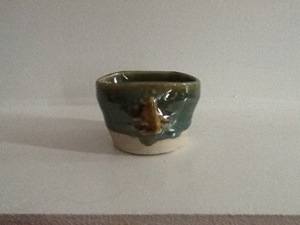
3. Green and brown pot
I was interested to see how the slip colours would look once fired. This little pot is a good example of how the slip mellows and appears much ‘sludgier’ once it has been in the kiln.


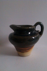
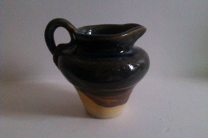
4. Blue rimmed jug
This jug is a good example of how a nicely thrown, nicely turned pot can be made ugly with a bad handle and a bad finish. For some reason I chose this pot to test drive my slip application skills and as you can see in the pictures it shows! It’s a messy and heavy handed finish which makes the pot look sloppy, even though it started life quite neatly.


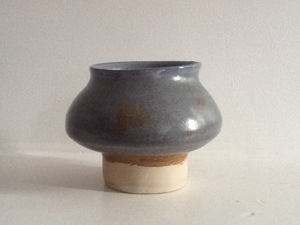
5. Wonky Vase
Although this is clearly a wonky shape I kept it anyway because it has character. I should have been more experimental with the finish but I ran out of time on the last day and ended up dunking quite a lot of them in the blue glaze. This one still has an area of brown matt slip at the bottom which works quite well.


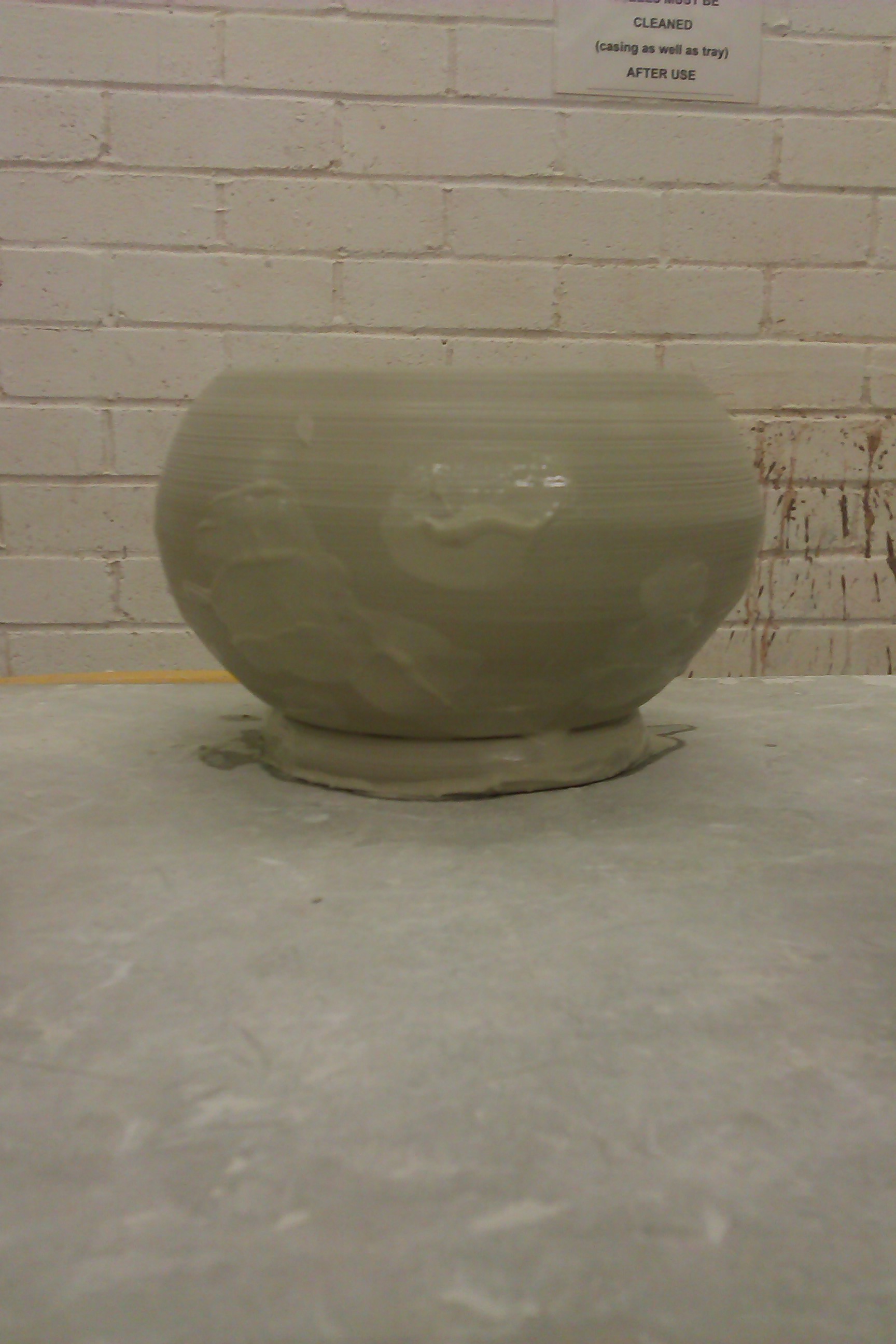
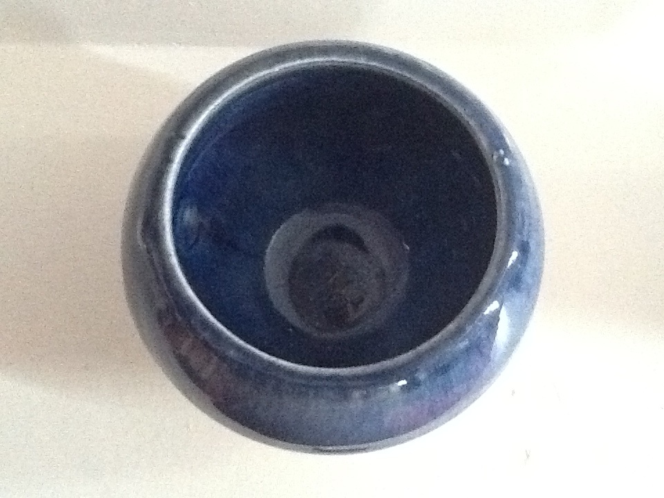
6. Two Tone Bowl
I think the colour combinations on this bowl work very nicely. The burnt bronze inside looks good against the blue on the outside. I tried to add a little detail with an attempt at banding white slip towards the base of the bowl. The decoration and brush strokes could have been neater but I would use this combination of colours again.

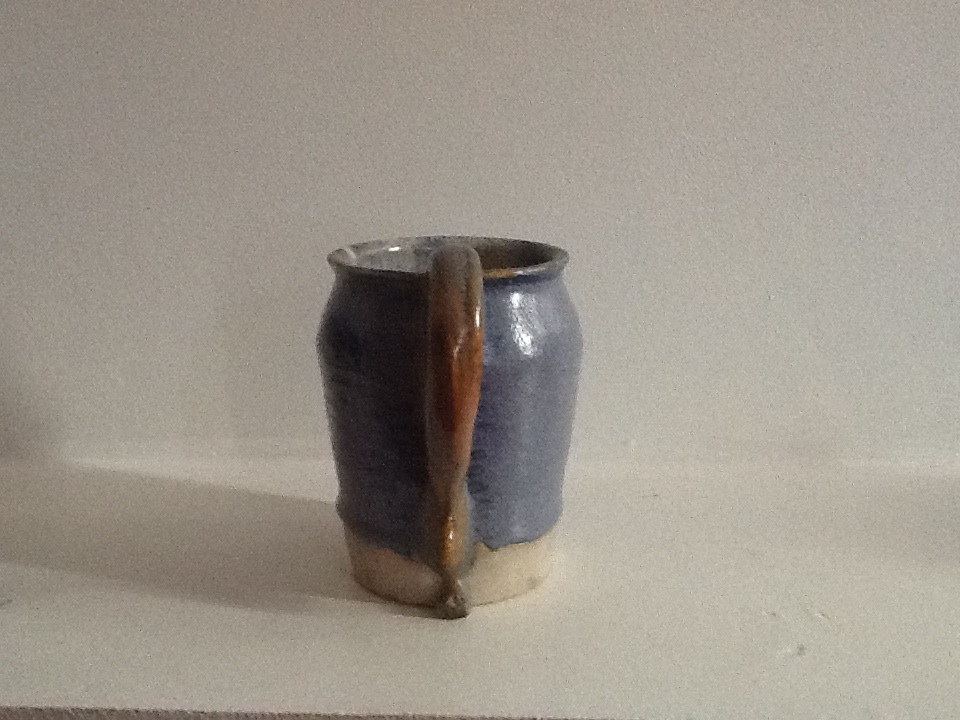
7. Small neat jug
I was super pleased with this jug because it was the first time I think I have ever made a handle that is in the right proportion and style for the jug. It was a very satisfying feeling even though I attached it very wonkily!


8. Banded Bowl
This was my most impressive attempt at banding. I applied stripes of white and blue fairly evenly although there were a few drips on the inside, which of course only adds to the character of the bowl! It is a little heavy but the banding looks effective.


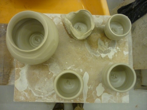
9. Yellow Egg Cup
Trying to make an egg cup the correct size in pottery is a very tricky business. Everything shrinks by approximately 15% in the kiln so you have to make everything 15% bigger than you want it to be and with egg cups this can become quite an exact science! Size wise this one came out about right and I like its unusual shape. The yellow slip is a lovely colour.

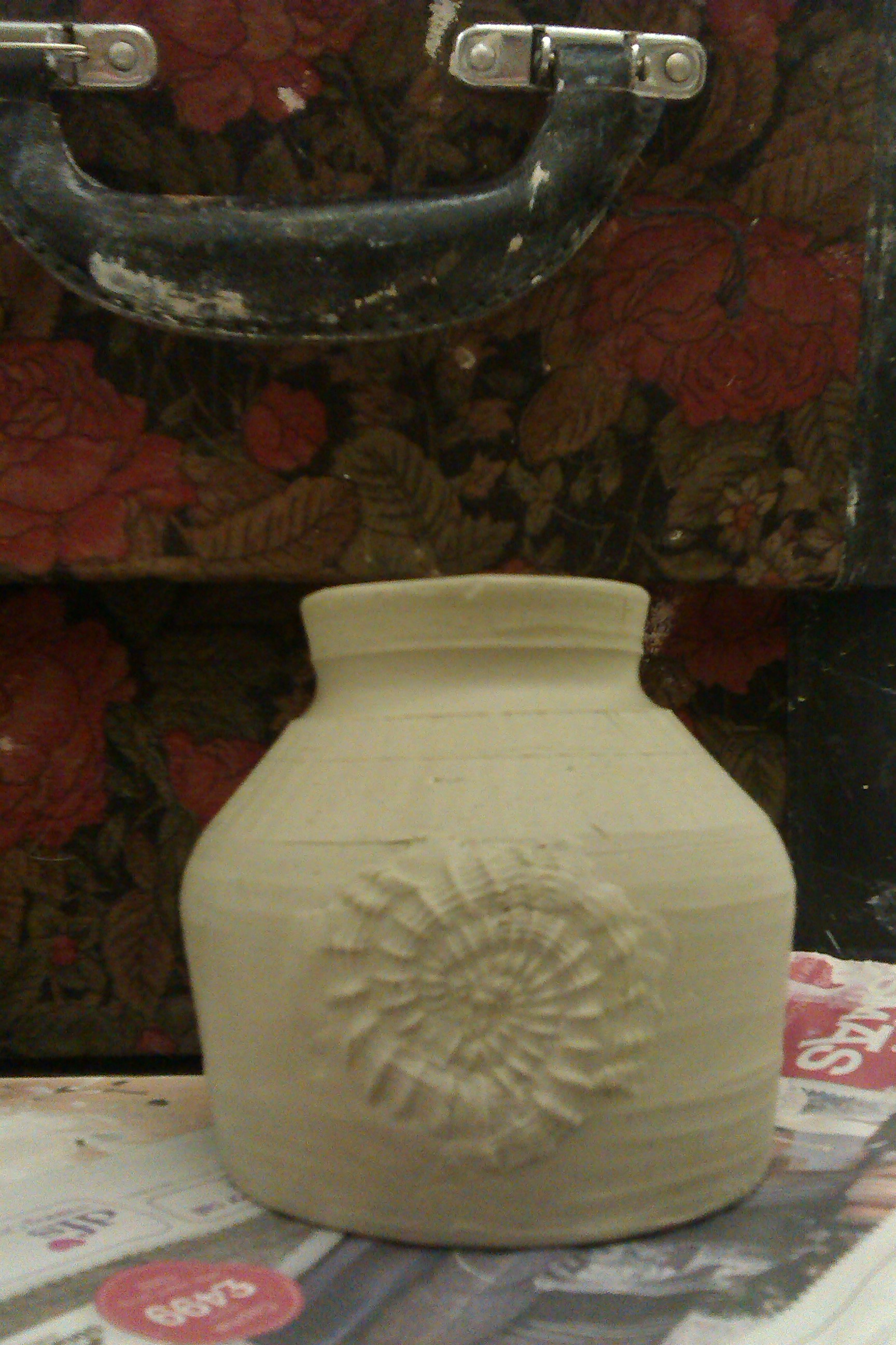
10. Unusual shaped jug
Again I think I accidentally dunked this jug in the wrong glaze! I had designed a more intricate pattern on the outside using yellow and brown slip but all that has been lost! You can however see the remains of the original slip towards the base which adds a matt contrast.