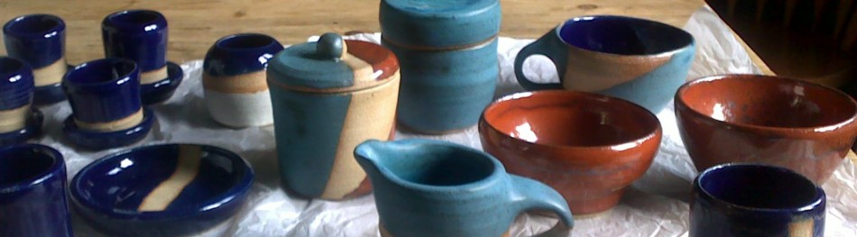
Throwing Pots. Term 1 – Photo Gallery
1. Matching pots
These matching pots were only matching because they both fell over on to the floor and got squashed the same amount down one side! I used a blue glaze to coat them and then flecked brown over the top using a toothbrush:


2. Pot with lid
This was one of my favourites so I was a bit worried about messing up the glaze. I decided to make the inside of the pot white and to highlight the butterfly with blue. The outside I glazed a solid blue and the lid a combination of blue, green and brown:


3. Large bowl
This was a bowl I threw from a chuck at the end of one of the classes. It is by far the biggest bowl I made during the whole term. I began by glazing the inside and outside white and then on the outside I put a green stripe half way down, followed by a brown stripe below it. I painted a green rim around the top and dotted it with brown. I think it’s one of my more successful experiments with glaze!


4. Pot with very thin walls
I turned this pot so much that the walls started undulating. Impressively it didn’t crack and survived being fired. I put a bit of all the glazes on to this pot. Inside it is white and the outside is mainly blue with a little brown and green painted over the top which gives it a nice shimmery effect:


5. Penguin pot
I tried to do more uniform stripes of brown glaze on this pot by painting them on using the wheel rather than by free hand. The main glaze is green inside and out. I also used a little brown on the inside to highlight the penguin:


6. Pot with a belly
I was pleased with the shape of this pot when I first threw it and I was happy to see the glaze came out much better than I expected. It’s similar to the large bowl, mainly white with a green and brown band on the outside, a colour combination I think works surprisingly well:


7. Small pot
I kept this one quite simple, blue inside and out with a brown stripe towards the base:


8. Pot with decorative base
I went straight through the bottom of this pot when I was turning it so had to patch it up with some extra clay. I glazed it green with a little brown to highlight the decorative part. I like the way it looks quite seventies!


The others that didn’t come out quite so well . . .
1. I liked the pot because it was an unusual shape, however the glaze I chose was too dark and looks very murky:


2. The pot itself had sagged a bit but I was pleased with the decoration around the outside. With the glaze I went way too experimental on this one! Not really sure what I was thinking, especially with the green dots but safe to say it didn’t work!


3. This pot was a bit wonky to start with but then the decoration was even wonkier and the glaze turned out very patchy where I’d missed bits!


4. I also had a similar problem with this one in that my glazing was a bit patchy. I don’t really like the blobby patches of blue either, although for some reason they look a lot better in the photo than in real life!


